Field types in the content editor
The contents of the form to create an entry depend on the schema configuration for that model. This document aims at assisting you in the content creation process, and explains how to use each field type as an Editor to create content.
Field names are customizable, this means that these fields might appear in your project under a name of your company's choosing. For practical purposes, you will find them named after the field type here.
For example, your project might have an asset picker field that allows selecting multiple assets listed as "Image carousel" in the content entry you're working with.
If you have trouble identifying a field type, ask your team lead for help. Once you know the field type, you can refer to our guide for working with that type.
#Single line text
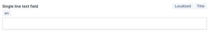 Single line text
Single line text fields often serve as titles or subtitles. The name of the field will often indicate what they are for, and you can simply add the information by typing it in.
#Multi line text
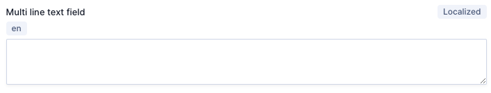 Multi line text
Multi line text fields can accommodate text in multiple lines, and often serve as description fields. The name of the field will often indicate what it is for, and you can simply add the information by typing it in.
#Markdown
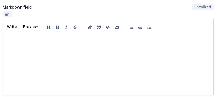 Markdown
Markdown is a popular markup language that you can use to add formatting elements to text.
Markdown fields can accommodate markdown text in multiple lines, and often serve as description fields.
The name of the field will often indicate what it is for, and you can simply add the information by typing it in. This field has a number of options for Editors writing content. Let's go over them:
Write: Select this option to write content.Preview: Select this option to preview what your markdown content will look like published.H: Heading. Select this option to make your line of text into a heading or subheading within the text. This option adds###to your Markdown field, but consider that in markdown each#represents a heading level. So, you could use#to represent a first level title, then##to represent a second level subtitle within that section. You can edit this manually in your Markdown field.B: Bold. Select the text you want to make bold and then click on this button. To get the same effect manually, add**before and after your text, like this**<your_text>**.I: Italic. Select the text you want to italicize and then click on this button. To get the same effect manually, add*before and after your text, like this*<your_text>*.S*before and after your text, like this~<your_text>~.Links: Select the text you want to add a link to and then click on the link icon. This will add the link syntax to your text, making it look like this[<your_text>](). Add the URL you want the text to link to between the brackets, like this[<your_text>](https://www.your_link.com).Quotes: Select the text you want to format as quoted, then click on the quotes icon. To get the same effect manually, add>before your text.Inline code: Select the text you want to format as inline code, then click on the inline code icon. To get the same effect manually, add ` before and after your text.Image: To add an image, click on the image icon to display the asset selection screen. Use the options on this screen to upload a new asset or select an existing one. The image added to your markdown field will have the following format. You can also add images manually using this syntax.Bulleted list: To format items as a bulleted list, select the text and then click on the bulleted list icon. You can also click on the icon, then write the list item, but you must do so for every line. To get the same effect manually, add-before each line of text.Numbered list: To format items as a numbered list, select the text and then click on the numbered list icon. You can also click on the icon, then write the list item, but you must do so for every line. To get the same effect manually, add1.,2.,3.and so on before each line of text.Checklist: To format items as a checklist, select the text and then click on the checklist icon. You can also click on the icon, then write the checklist item, but you must do so for every line. To get the same effect manually, add- []to the text, like this- [<your_text>].
You can learn more about Markdown here.
#Slug
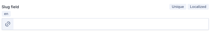 Slug
Slug
The slug field is a URL friendly identifier. If your schema configuration determines that the slug generates from a template, it will autocomplete. If not, you can write it yourself.
A usual format to follow for the slug is to use the same text as your title line in lowercase, and with - instead of spaces.
#Rich text
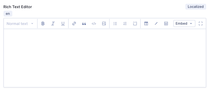 Rich Text
This field is a text editor with formatting included in all Hygraph projects. It provides great flexibility when it comes to creating, editing, and manipulating content entries that include text and images.
If your project schema is configured so that your model has a Rich Text field, you'll see it like the image shown above in the content editor. Let's go over what you can do with it:
Text format: This dropdown allows you to format text you've highlighted in the text area. You can format it as normal text as well as different heading levels.Bold: Use this typography option you to make text bold.Italic: Use this typography option you to italicize the text.Underline: Use this typography option you to underline the text.Link: Use this option to add a link. Click here for more information.Block quote: Use this option to format the text as a block quote.Code: Use this option to format the text as inline code.Asset: This option allows you to include an asset. Click here for more information.Bulleted list: Use these options to create a bulleted list.Numbered list: Use these options to create a numbered list. -Code block: Use this option to format the text as a code block.Iframe: An inline frame - or iframe - is anHTMLelement that loads anotherHTMLpage into the current document. Click on this button to displays a popup where you can enter an iframe URL (the URL of the HTML page you wish to insert in the current document). After you've entered a valid iframe URL, click on theOKbutton to add it to your content.Class: Classes in this context are styles that are coded in theCSSof your front end. If your project uses this, you will be informed what the class names are. Simply highlight the text and click on theClassbutton. Use this option to assign classes to your text. A popup will display for you to type in theClass name, then click onOkto finalize the process.Table: Use this option to add a table. Once the table is added, if you click on it and go back to the same button, it will now readEdit tableand will offer the following options:Remove Table: Use this button to remove the selected table.Toggle Headers: Use this button to make the first line into table headers. You can undo this by clicking onToggle Headersagain.Insert Columns: Use this button to insert a column. It will be inserted to the right of the cell your cursor is on.Remove Columns: Use this button to remove a column. It will remove the column your cursor is on.Insert Row: Use this button to add a row to your table. It will be added below the row your cursor is on.Remove Row: Use this button to remove a row from your table. It will remove the row your cursor is on.
Embed: If embeds have been configured for the Rich Text field in your project's schema, this option allows you to embed content from a model. Think of it as adding content entries within this content entry. The models that you can embed content from depend on the schema configuration for this field. Click here for more information.Enter fullscreen: If the workspace seems too small, you can use this option to enter the fullscreen rich text editor mode. You can exit this mode by clicking on theExit fullscreenbutton.
#Links
To add a link to your content entry while using the Rich Text field, click on the Link button to display the Insert link popup. This popup contains two tabs: Settings and Attributes.
Settings
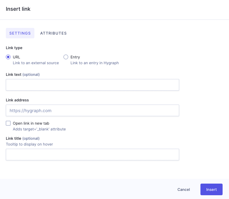 RTE - Insert link - Settings tab
- Link type: Use the radio buttons to select one of the two options. Your selection modifies the fields that show on screen.
- URL: Select this option to add a link to an external source, that is, a link outside of your Hygraph project.
- Entry: Select this option to add a link to an existing entry in your Hygraph project.
- Link text: You can add text for your link in this field. If you are creating a
URLlink type and don't complete this field, the Link address will be used as Link text. This field becomes required for theEntrylink type. If you selected text before clicking on the link button, this field will be autopopulated with the selected text. - Link address: Required field where you can type the URL you want to link to. This field only displays for the
URLlink type. - Open link in new tab: Use this checkbox for your link to open in a new tab in the browser. This field only displays for the
URLlink type. - Link title: Optional field where you can enter text that will display when hovering over the link. This field only displays for the
URLlink type. - Select entry: Click on
Add existing entryto select the entry in your Hygraph project that you want to create a link to. Only models that can be embedded will display in the dropdown. This field only displays for theEntrylink type. - Action buttons:
- Cancel: Click on this button to cancel the process.
- Insert: Click on this button to save the link and add it to your content entry.
Attributes
You can optionally complete the following HTML attributes:
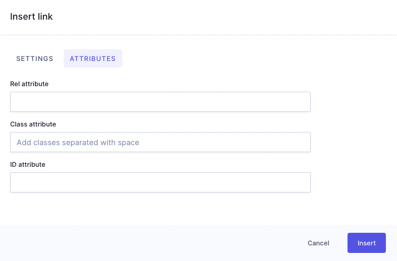 RTE - Insert link - Attributes tab
- Rel attribute: This attribute defines the relationship between the current document and the linked resource.
- Class attribute: This attribute specifies one or more
classnamesfor an element. You can add classes separated with spaces here. - ID attribute: This attribute is used to specify a unique
idfor anHTMLelement. - Action buttons:
- Cancel: Click on this button to cancel the process.
- Insert: Click on this button to save the link and add it to your content entry.
#Assets
Clicking on the Assets button opens the Select Asset screen:
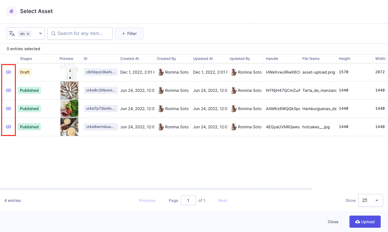 RTE - Select assets
You will normally use this option to add images to your rich text.
Select an asset from the available assets list by clicking on the purple reference icon located at the beginning of each asset entry. This will automatically add the asset to your content.
If the asset you need has not yet been uploaded to your project, you can do so from this screen as well by clicking on the Upload button. To do this, simply click on Upload and follow our Upload asset step-by-step guide from step 2 onwards.
#Embeds
If your project has been configured to enable embeds in rich text, use this option to create inline and/or block embeds.
Only the content from the selected models in the Rich Text field schema configuration is available to be embedded.
Inline embeds
Inline embeds give Content Creators maximum flexibility to add references or relations directly within the text so they can move faster. This also clears up clutter around content creation, so they are able to add things like authors, citations, product attributes and more without having to add extra fields within the content entry.
The example video above shows how to use inline embeds to add an author to your rich text.
To select an entry and add it to your content, simply click on the purple reference icon that you can find to the left of each content entry.
The editor displays this embed as a dropdown. If you click on it, you will find the options to Edit or Remove it.
Block embeds
Block embeds give Content Creators more flexibility with less clutter. Use block embeds to insert assets and other content entries inside the text as a block. This can be useful when adding images like logos, or referencing audiences to previous created material that support the new content item like blog posts, documents, announcements, etc.
The example video above shows how to use block embeds to add a content entry from a different model to your rich text. In this case it is a blog post being referenced in the current content.
To select an entry and add it to your content, simply click on the purple reference icon that you can find to the left of each content entry.
The editor displays this embed as a block, which has a three dots context menu on right. If you click on it, you will find the options to Edit or Remove the embed.
#Number
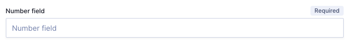 Number
You can only enter numbers in this field. You can do so manually, or using the up / down arrows that display to the right of the field when you click on it.
This field is normally used for information such as IDs and quantities.
#Float
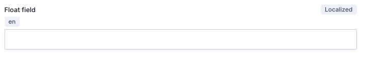 Float
Float
Floats are commonly used for calculations. You can type in numbers that can have up to three decimals. You can enter the numbers manually, or using the up / down arrows that display to the right of the field when you click on it.
This field is normally used for information such as ratings and prices.
#Boolean
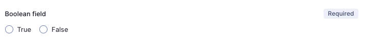 Boolean
A boolean field only allows two values: true and false.
What true and false represent, depends on what this field is used for in your project.
#Date
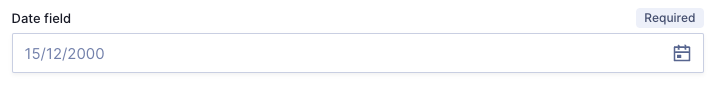 Date
Date
This field is a calendar picker. Click on the calendar icon to the right of the field to select a date.
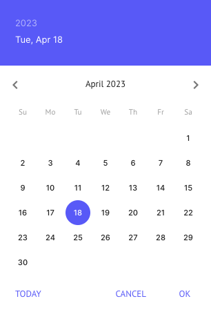 Calendar picker
You can click on Today to set it to the current day, or manually select a date on the calendar then click on ok.
#Date and time
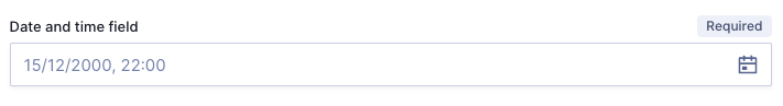 Date and time
This field is a calendar picker that also let's you select the time.
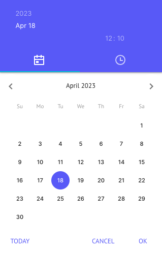 Date and time - Date picker
You can click on Today to set it to the current day, or manually select a date on the calendar.
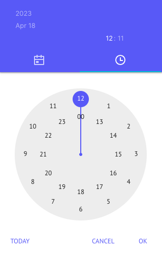 Date and time - Time picker
You can use the clock figure to pick a time. Click on Today for it to automatically select the current time, or drag the purple dot to first select the hour, then the minutes. You can optionally just click on the numbers you want on the screen rather than drag the cursor.
As you make your selection, you can see the time you above the clock icon to the left of the popup. The system highlights the hour / minutes to let you know which one you are selecting.
Once you have selected the date and time you want, click on Ok to finish.
#JSON editor
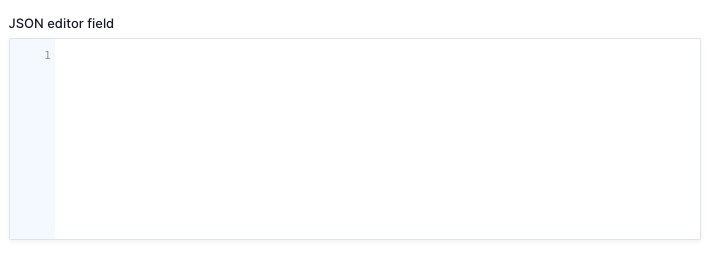 JSON editor
This field is not normally used by Editors, but it's useful to know that it supports JSON syntax (JavaScript Object Notation), and is often used for storing large amounts of data from other systems.
#Asset picker
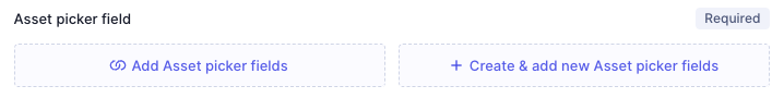 Asset picker
You will normally use this option to add images to your content entries. Note that assets can be other file types as well, such as documents. You might have to add different assets to your project depending on the type of content your create, but regardless of the file type, the Assets screen works in the same way.
The + Create & add new <field_name> button follows the Add asset entry flow, then returns you to the current screen, where you'll see your new asset added to the entry.
The + Add <field_name> button works as follows:
Select assets
Depending on assets configuration in your project, you will be able to select one or more assets. If configuration allows selection of a single asset, you can select an asset from the available assets list by clicking on the purple reference icon located at the beginning of each asset entry. This will automatically add the asset to your content.
If configuration allows selecting more than one asset, you can use the available checkboxes to select the assets you want instead, and then click on Add selected assets.
If the asset you need has not yet been uploaded to your project, you can do so from this screen as well by clicking on the Upload button. To do this, simply click on Upload and follow our Upload asset step-by-step guide from step 2 onwards.
#Color
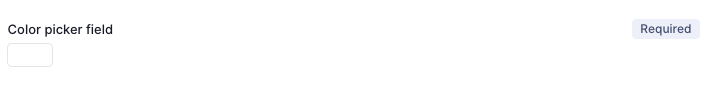 Color
Color
You can use the color picker field to select a color. Click on it to display the color selection palette.
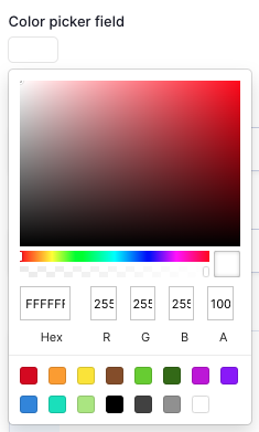 Color picker displayed
To select the color, you can either click on it directly on the palette, type in the Hex color code, or the RGB color code. You can also control color opacity typing a value in the A field. A set to 100 is a solid color with no transparency.
#Map
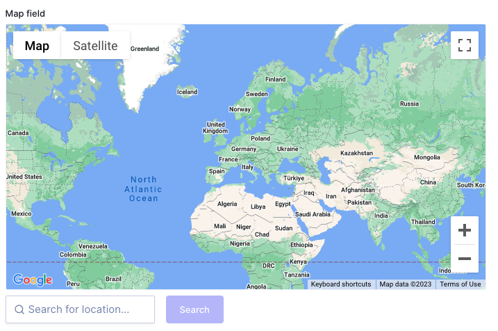 Map
Map
The map field is a Google Maps tool that lets you select geo coordinates on a world map.
This field offers the following controls:
Map: Use this button to display a map view.Satellite: Use this button to display a satellite view.Fullscreen: Use this button to display the map on fullscreen mode. Click onescon your keyboard to exit fullscreen mode.+: Use this button to zoom in.-: Use this button to zoom out.Search for location: Use this text field to enter a location name, then click on theSearchbutton to initiate the search. Your search results will display on the map.
If you're using a laptop with a trackpad, you can also use it to zoom in / out, and to navigate the map.
#Dropdown field
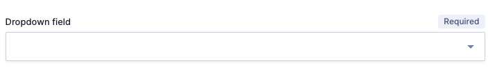 Dropdown field
A dropdown field lets you select an option from a list of items, which has previously been configured in the schema as an enumeration.
Simply click on it and select one of the options.
#Components
A component is a predefined set of fields that can be used across project models and content entries. Hygraph offers two types of component fields:
Basic component field: A simple collection of fields that you can embed in your content entry.Modular component field: A dynamic collection of fields, in the sense that it might contain several components, which you as an Editor will be able to select from when working on a content entry. Selecting a component embeds its fields in a content entry.
Components may contain all the other types of fields in this document. When inside a component, a field works the same way as when it is outside of a component.
You can find out the field types, look them up in this guide, and follow the instructions on how to work with them.
You can use Basic components for content that will remain the same in all entries.
Modular components are often used for blocks, where a content entry can take many shapes and therefore needs to be dynamic. This way you as an Editor will be working with a more compact content entry template, and simply select the component or components you need for that specific content entry.
Components internal field combinations depend on project configuration. As each project is unique, this document only covers the basic workings of components.
#Basic component
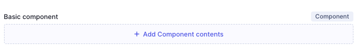 Basic component field
To start working on the contents of a basic component field, click on the +Add <component_name> link. This embeds the fields that make up that basic component in your content entry so you can start working on them.
Basic component example
The following example uses a basic component to add a banner to a blog post:
As an Editor working on our example, you need to click on + Add entry in the Content editor to create a new blog post. After adding a title and a slug, click on the banner component, which in this case is a basic component.
Because it is a basic component, the button simply says + Add Banner. After clicking on it, you can start working on the fields that make up this component.
Remember that components are a reusable collection of fields, and that fields inside components work just like fields outside of them.
You have all the information on how to work with each field type in this document, you just need to identify them. For instance, the Caption shown in this example is a single line text field.
#Modular component
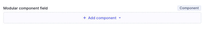 Modular component field
To start working on the contents of a modular component field, click on the +Add component link to display the components menu.
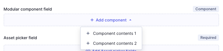 Modular component field displayed
Clicking on a component from the menu embeds the fields that it contains in your content entry so you can start working on them.
If the project configuration allows multiple values, you will be able to add more than one component to a content entry. To do so, click on the + Add another component link at the bottom of the section to display the selection menu again.
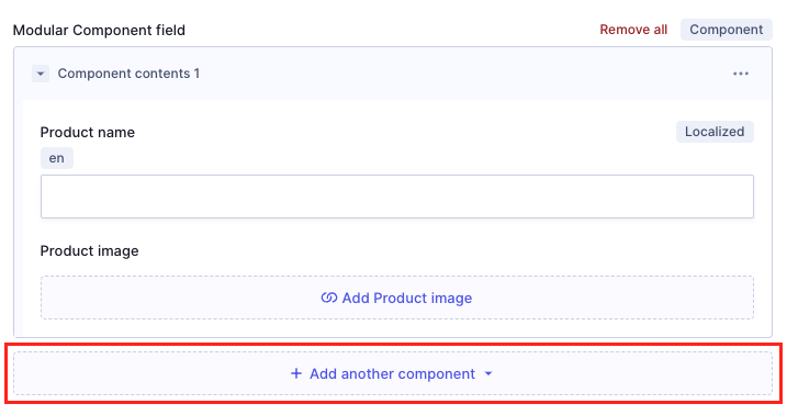 Add another component
If you're working with a modular components fields and have added several components to your content entry, you can reorganizing them by using the arrows that display on each line when you select multiple components.
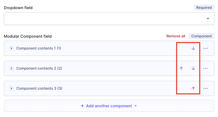 Organize components
Each component on the list has a three dots context menu, which displays the following options when you click on it:
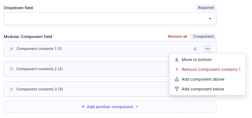 Modular components context menu
Move to bottom: Use this option to move the current component to the bottom of the list.Remove <component_name>: Use this option to remove the current component from the list.Add component above: Use this option to add a component above the current one. Scrolling over this option displays a list of components. Select one by clicking on it.Add component below: Use this option to add a component below the current one. Scrolling over this option displays a list of components. Select one by clicking on it.
Modular component example
The following example uses a modular component to add a video section to a blog post:
As an Editor working on our example, you need to click on + Add entry in the Content editor to create a new blog post. After adding a title and a slug, move onto the component section, which in this case is a modular component.
Because it is a modular component, Clicking on + Add component displays the selection of components that you can choose from. After selecting the Video section option, you can start working on the fields that make up this component.
Remember that components are a reusable collection of fields, and that fields inside components work just like fields outside of them.
You have all the information on how to work with each field type in this document, you just need to identify them. For instance, the Thumbnail shown in this example is an asset picker field.
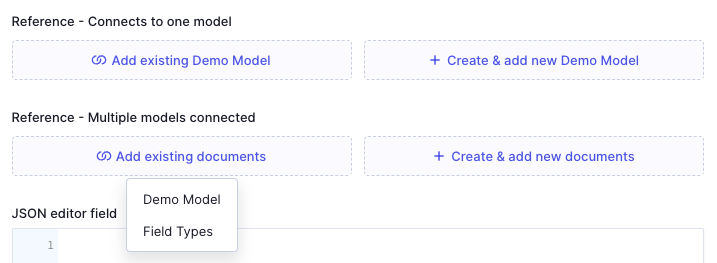
#References
In content entries you may find references - also called relations - that connect to one model, or more. The behavior of the field will be slightly different depending on this:
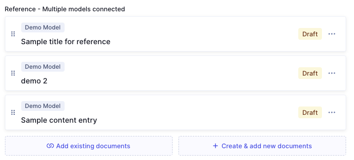
 References
The above example shows both. If you click on Add existing (...) or Create & add new (...) on a reference that connects to multiple models, a menu displays where you can select which model, as you can see on the image. Clicking on an option displays either the selection or creation screen for the entries of that model.
Instead, if you click on Add existing <model_name> or on Create & add new <model_name> on a reference that connects to only one model, the selection or creation screen for that model will display directly.
Independently from how many models a reference might connect to, configuration might also make it possible to select one or more entries. There is a detailed explanation of this below, but basically:
- References may connect to one model or more.
- Configuration may allow you to select only one entry from the connected model, or more.
Also, please consider:
Add existing:- The way to add an entry, as well as the options shown on screen afterwards are different for references that allow selecting only one entry, versus references that allow selecting multiple entries.
Create and add new:- The options shown on screen after creating & adding an entry are different for references that allow selecting only one entry, versus references that allow selecting multiple entries.
- This is a regular content creation screen, which may contain different field types depending on model configuration. The created entry is added to the references upon saving.
#Single entry
If you're creating & adding rather than just adding an entry, skip over to the screen options, below the entry selection flow.
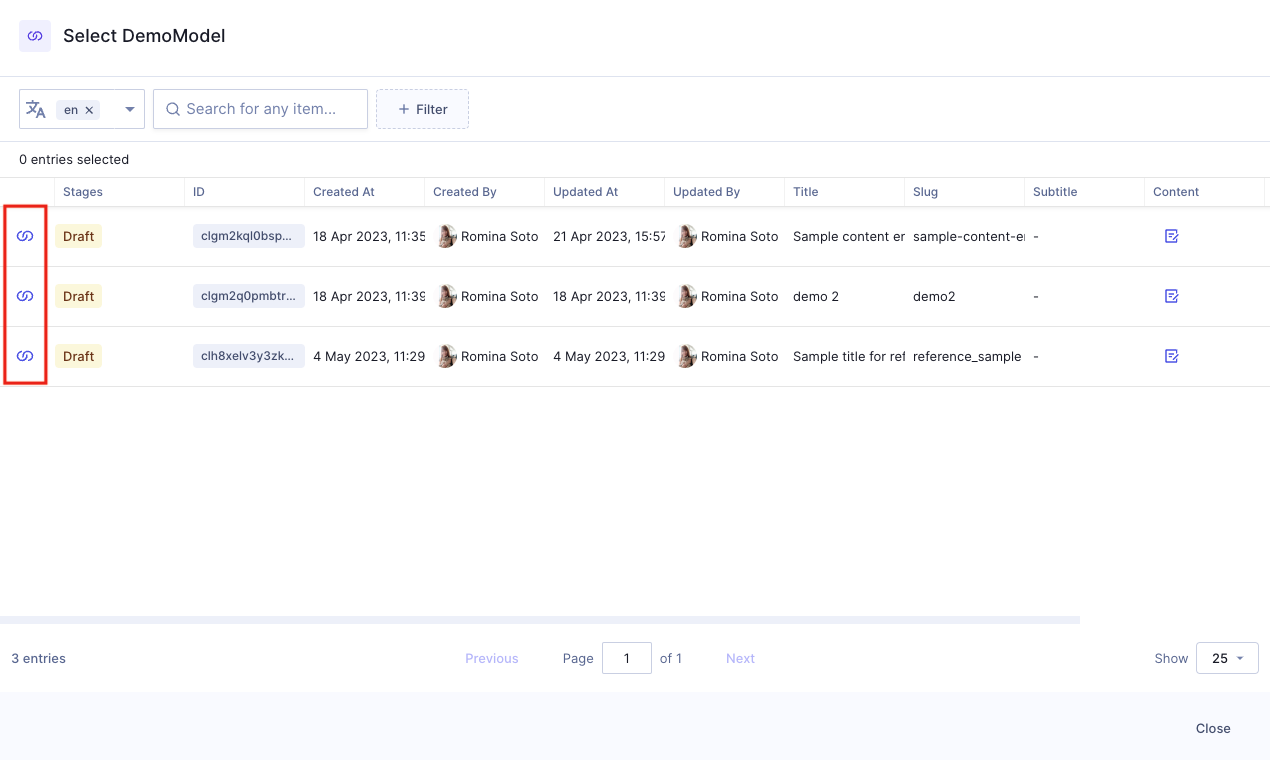 Select a reference
Click on the reference icon to select a reference. Clicking on the icon closes the screen and displays the reference on the list:
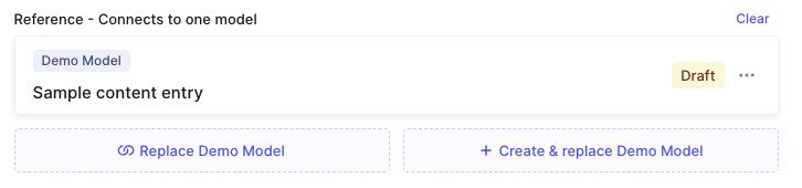 Reference selected
Your options:
Replace <model_name>: Use this to change your entry selection. This opens the selection screen again, where you can repeat the process with a different entry.Create & replace <model_name>: Use this to create a new entry and replace the current one with it. This does not delete the previously created entry.Clear: Use this to remove the selected entry.- 3 dots context menu:
Edit: Edits the related entry, not the entry selection. Edition here follows the standard editing flow.Duplicate: Duplicates the related entry. You will need to save before moving on. The system then takes you to the duplicated content entry automatically. There, you can make all necessary changes before saving and/or publishing. Check out our Duplicate relations document for more information on this.Remove: Removes the related entry from the screen.
#Multiple entries
If you're creating & adding rather than just adding an entry, skip over to the screen options, below the entry selection flow.
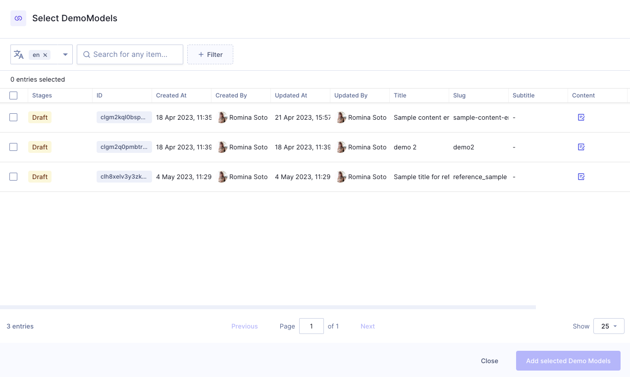 References - select multiple entries
Use the checkboxes to select one or more entries, then click on Add selected <model_name> at the bottom of the screen. he entries you selected will display on the references list.
 References - multiple
Your options:
Add existing documents: Use this to open the selection screen again to add more documents.Create & add more documents: Use this to create a new document and add it to this list.- 3 dots context menu:
Edit: Edits the related entry, not the entry selection. Edition here follows the standard editing flow.Duplicate: Duplicates the related entry. You will need to save before moving on. The system then takes you to the duplicated content entry automatically. There, you can make all necessary changes before saving and/or publishing. Check out our Duplicate relations document for more information on this.Move to top: Moves the related entry to the top of the list. This option does not display if you're using the context menu on the item that is already at the top of the list.Move to bottom: Moves the related entry to the bottom of the list. This option does not display if you're using the context menu on the item that is already at the bottom of the list.Remove: Removes the related entry from the screen.Add entry above: Allows adding an entry above the current one. Clicking on this displays two action links on top of the current entry, giving you the option to add an existing entry or creating and adding a new one.Add entry below: Allows adding an entry below the current one. Clicking on this displays two action links below the current entry, giving you the option to add an existing entry or creating and adding a new one.